I transform information challenges into visual systems that change how people see the world.
For organizations dealing with extreme complexity, high stakes, or problems too unique for standard formats. Every system built with intention and form in perfect alignment.
Explore work → Get in touch →The limits of standard data visualization
Organizations dealing with high-stakes information, genuine complexity or stalled innovation often get stuck when relying on standard templates or out-of-the-box solutions.
In an era where AI can generate a dashboard in seconds, the challenge is no longer making data visible—it's making it mean something. This creates a friction between what the data is and what the audience actually needs to understand or feel. I am not an illustrator who makes data pretty. As a Visual Systems Designer, I build systems from the ground up — designed to bring ungraspable scale and extreme complexity down to a human scale.
When do you need a Visual Systems Designer?
High-stakes impact: When the outcome genuinely matters and a conventional approach won’t be enough.
A scientist presenting a paradigm-shifting finding who needs the work to land with the weight it deserves. A policy maker who needs to shift public perception around a complex health issue — and knows that standard charts won't do it. A keynote speaker who needs to leave the audience seeing their field differently.
Stuck situations: When you’ve tried everything within the conventional toolkit and nothing works.
A designer who has tried every variation of a visualization and still can't make the complexity readable. A team that keeps running brainstorms and keeps arriving at the same kinds of solutions.
Genuine complexity: When the data or subject matter is inherently complex — not as a failure of design, but as a structural reality.
A system with hundreds of interdependent variables. A phenomenon that only reveals itself across multiple scales. A dataset where the relationships are the story. Standard templates don't fall short here because of poor execution — they fall short by design. Reducing the complexity would reduce the truth.
Innovation: When you see friction in something that exists and, instead of fixing it, you build a new paradigm from scratch.
A researcher who wants to build an entirely new way to present findings in her field, not just a better version of existing formats. An organization that wants to rethink how it communicates data to the public from the ground up. A communicator who needs to invent a format for a subject that has never been communicated well.
Meaningful improvement: When something works, but you sense it could be fundamentally better. You’re not stuck, and the work doesn’t need to be revolutionary — but you want to go beyond tweaking.
A team that has improved their dashboard three times over and now senses the next step requires a different question, not better execution. A data journalist whose work is technically strong but rarely breaks through beyond their own community. A scientist who has made the same kind of visualizations for years, knows they work, but keeps wondering: is this actually the best way to show this?
Diagnosis: When a piece of work didn’t create the impact you expected and you need to understand why.
A visualization that received positive feedback but didn’t change decisions. A campaign that reached its audience but failed to move them.
Selected work
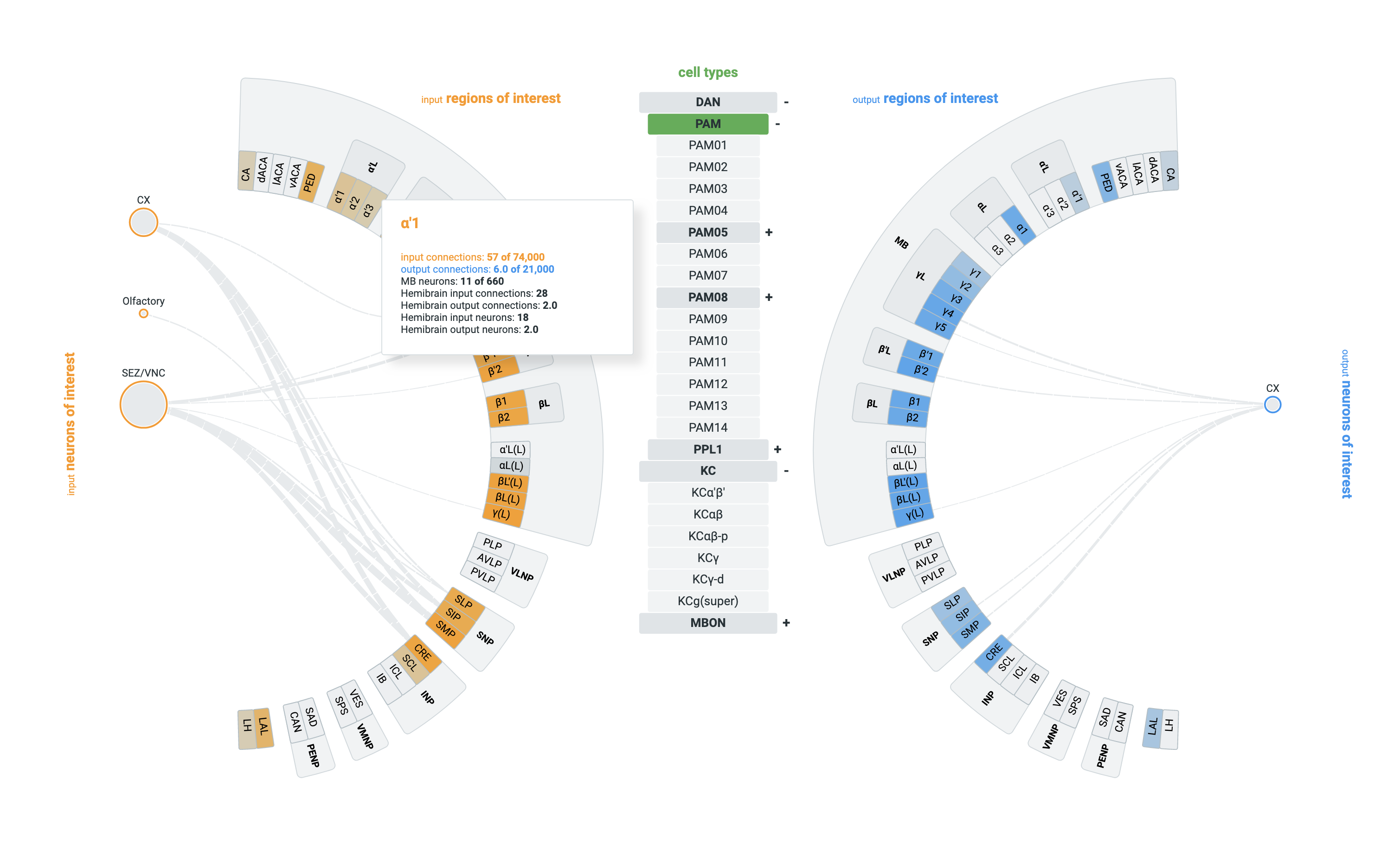
The Exploratory Instrument
An interactive system built to make the extreme complexity of fruit fly neurons navigable for researchers.
The Experiential Magnet
Deconstructing time into a 3D cycle to make the rhythm of a 24-hour logistics operation visceral.
Cosmic Architecture
Mapping and visually unlocking over 1.3 billion stars.
Feeling COVID infection rates
Turning abstract numbers into a visceral experience of COVID-19 infection rates.
Testimonials
His visualisations have brought beautiful, educational, and inspiring new dimensions to our Gaia mission — all in a scientifically-rigorous way.
Mark McCaughrean - Senior Science Advisor European Space Agency
Collaborating with him gave us more insights about our own data. His visuals spectacularly translate complex content into beautiful art that tells a story.
Ruchi Parekh - Neuroscientist Howard Hughes Medical Institute
He strikes the perfect balance between being an independent problem-solver and a collaborative team-member.
Jennifer Christiansen - Senior Graphics Editor Scientific American
Trusted by
- European Space Agency
- World Bank
- Nature
- Scientific American
- Microsoft Research
- Howard Hughes Medical Institute
- Deltares
- Dutch Railways
- Google News Lab
- Unesco
- Amsterdam Airport
- Heineken
- Unicef
- World Economic Forum
- World Food Programme
- Nielsen
- Philips
- Popular Science
- National Geographic
- The Hague Center for Strategic Studies
- Chef James Briscione
- Axpo
- Erasmus University
- University of Innsbruck
The Frameshift Lab
When I'm not building bespoke systems for clients, I explore the absolute boundaries of data structures, perception, and cognition. I refuse to accept templates. This lab is a collection of that boundary-pushing work — including deep visual explorations that have been featured and published in leading scientific journals or included in permanent museum collections. This is where the thinking happens that makes the client work possible
Explore the lab →Ready to shift your perspective?
Does your organization deal with extreme data density, stalled R&D communication, or a high-stakes public challenge? Stop optimizing the wrong formats.
Get in touch →